1. Barcamp Omaha 2012
is a fully illustrated event website design. Dark building on the background, chains with rough info blocks and light grunge effect invoke gruff and catching feelings.
2. These Are Things
bets on popular vertical parallax effect including only necessary sections. While you going down with two pictorial members of the agency you can enjoy a little story about its daily routine.
3. Sloche
goes for the retro style with a lot of beard textures and images. You can take delight of blurred diamond patterns and a bunch of vintage elements that harmoniously built-in.
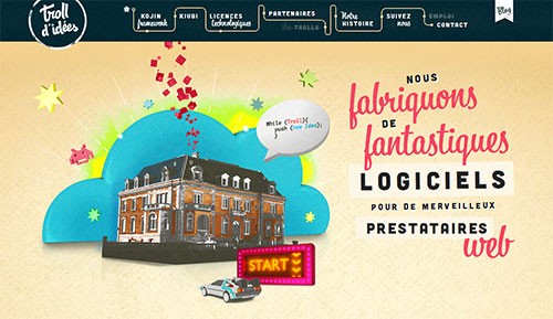
4.Troll d’idees
shines with originality starting from odd navigation and layered landing page and ending up with exceptional contact form made with nostalgic touch.
5. Mr Brown
uses texture of old wallpaper as a background and a lot of domestic stuff such as furniture, lamp, and, of course, improvised paintings in order to make website correspond to quote “home, sweet home”.
6. From the Front 2012
tells the whole story about the members, representing them as a pirates. Every character has its own description that opens on a mouse hover.
7. Barrett and Welsh
has a bunch of amazing hand-drawn animations on each page.
8. The Gobstopper
takes on a sharper cut look. A load of paper cut images, vintage typography and nostalgic ornament decorations make the website look memorable and clean.
9. Rank Warrior
boasts of paper-based website designs including creased pulp-like illustrations.
10. Track Them
uses horizontal parallax effect in creating perfect user experience. Grunge touch gives a note of mystery.
11. Activation Group
uses a widescreen horizontal slider that helps to navigate between main pages. Landing page includes a set of square images that has entertaining moving effect upon them.
12. Komoda Cafe
employs a bundle of muted coral and cream color ribbons and tags, recreating an old-school feeling.
13. Dominos. Flash & Goal
uses vector illustrations that have been implemented on a cardboard-like background. Developer deliberately hide menu items in order to make users to go through all the pages.
14. Heather Conlan.
Since widescreen photography background is a present web design trend, I want to include this website in our collection. It strikes with amazing high-quality images and clearly stand-out menu section on the bottom.
15. Mobile Statistics
is a brand new trend - infographic’s website design. More recently, designers begin to add schemes, statistics and infographics in their designs to make it both informative and captivating.
Источник: webmaster-tips.net


